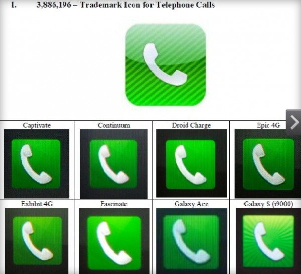
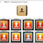
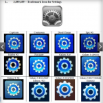
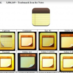
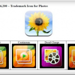
New details from the Apple vs. Samsung case show just how similar Samsung icons are to those trademarked by Apple. The evidence is certainly compelling and really makes a good case for trademark infringement. Again, watch out Samsung…
Some of the photos below are pretty ridiculous. Samsung obviously didn’t have a shred of shame when designing these icons. Well I guess it wouldn’t technically be called designing when you’re copying and pasting elements to make new icons.
This isn’t the first time Samsung has shamelessly ripped off Apple designs, they’ve drastically altered their smartphone line to match Apple’s design work since the original iPhone was released in 2007.
Check out the gallery below.
9to5Mac reports:
Apple has two witnesses for the stand who are familiar with designing user interfaces on the slate. Those two include Happy Mac logo creator Susan Kare and the former President of the Industrial Designers Society of America Peter Bressler. Both, of which, could certainly help Apple a ton.
What do you think of these icons below?
The designs look pretty damn similar to me.
