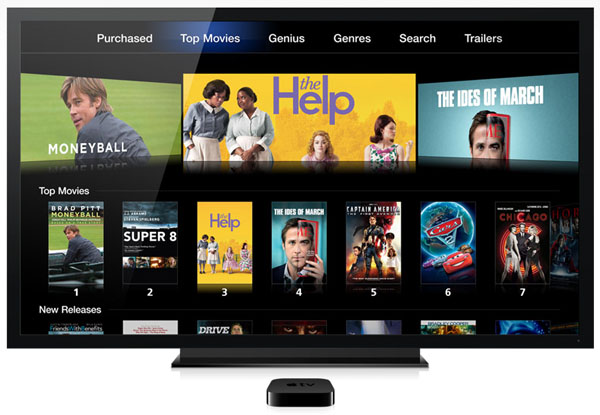
The new Apple TV user interface design that came out with the new Apple TV was actually created 5 years ago and was thrown out by the late Steve Jobs, who didn’t like it. This is according to former Apple TV engineer Michael Margolis who claims to have “implemented much of the Apple TV 2.0 UI years ago.”
Margolis said on Twitter last night that that Steve Jobs said no to the UI changes 5 years ago, however Apple’s senior executives recently approved the new UI.
Margolis went on to say that:
Thanks, though most of the product is the same. I also don’t like the top-bar-navigation on the app store UI.
Fun fact – those new designs were tossed out 5 years ago because SJ didn’t like them. Now there is nobody to say “no” to bad design.
Margolis closed by saying that as far as he knew “the whole team has left/been replaced.”
Apple TV’s new user interface was released to mixed reviews, with some liking it believing that it hints at apps running just as good on the Apple TV as they do on the iPhone and iPad and others who feel the new icons are unpleasing to the eye and disorganized.
What do you think of the new Apple TV software?
Don’t forget about macmixing.com’s new iPad giveaway. We will be announcing the winner on our podcast “The A Word” on April 1st. Click here for details.
