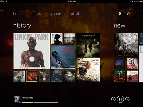
What happens when something completely sucks on another platform? You bring it to iOS and somehow it’s just better. Well that’s not exactly true, but it seems to be the case with this new music player app called Track 8 by Ender Labs.
If you want a Windows Phone Metro-style app for some reason, check this out…
Now I’m not a fan of ripping off designs, but I am a fan of functionality. Track 8 is a new music app for iPad that’s a complete ripoff of the Windows Phone UI. This in itself isn’t right. But the funny part is that it seems to work better with iOS than it does with the Windows Phone native UI it’s taking hints from.
Check out the promo video…
I’m in shock that this app even passed Apple’s strict approval. Completely biting the Windows Phone UI should have definitely put this app on the “naughty list”. But on the other hand, the app makes better use of something native to it’s direct competition. It just looks so awkquard on iOS.
One thing is for sure though, it’s a pretty decent app for $1.99.


